BUSINESS INSIDER | STILL STANDING - LEAD MOTION DESIGNER

With millions of views, Still Standing is Business Insider’s most popular history YouTube series. It’s even won a gold, silver and bronze Telly Award for my motion graphics.
Since its inception in 2020, I’ve been the lead motion designer.
During the pre-production planning for the series, I was tasked with designing and choosing the graphics style for it.
The first thing I tackled was the title animation and lower thirds. Not having a solid font choice yet, I wanted to make sure I got the feel of the show across in the movements of the text. Since the show presents crafts that were honed over generations, I wanted something that would visualize the build up of knowledge and skill. Having the letters/words pop up/flip up helps make that connection.
Next was choosing a font – my favorite part of the design process. For me, it had to look like something you’d see on an old document or map, but minus the serif. Thinking about the movement of the letters/words and the idea of building, I went with a condensed font that made the letters look slightly tall. With that it made the building up movement more pronounced.

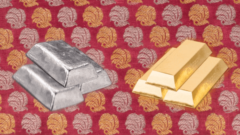
For the rest of the graphics and animations, I wanted to stick with a historical and vintage vibe. I drew a lot of inspiration from the History Channel and Block & Tackle’s promo graphics for SYFY’s Wynonna Earp show. An animated textured background and some kind of noise grain or scratches were a must.
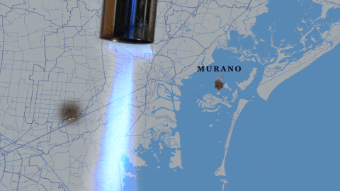
Keeping with that old-time feel, I chose an earthy color palette. Depending on the nature of the craft, I’d have the choice between a tan or gray background. To give a bit of extra color and the idea of going back in time, I also added a lens leak over the animated history sections.


After the graphics style was locked in, Still Standing published with much success. However, according to YouTube, the animation sections were a major place where our audience was dropping off. Determined to keep the animated history sections for Still Standing, I experimented with transitions with each and every new episode. Within a few months, I found the solution: make transitions into and throughout the animation as seamless as possible. Now the drop off is virtually none when going into the animation sections.