INSIDER INC | VOICES OF COLOR - LEAD MOTION DESIGNER

The revival of the Voices of Color video team didn’t last long, but it was a great opportunity to be involved in the full process of creating new series and, as an art director, designing the graphic style for them.
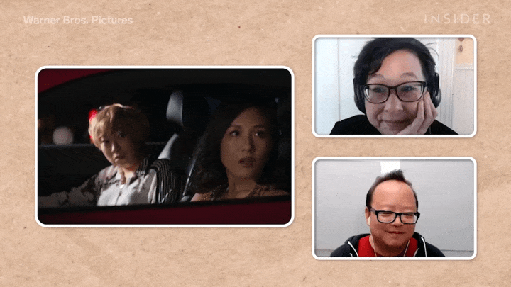
Depiction Matters only had 1 episode, but creating a video with a group of people critiquing movies was a massive undertaking. For that YouTube series, I helped the producer with the initial pitch by creating rough mockup visuals for the animated title card, box in box options and thumbnail.


Once the producer had more of an idea of how many people were going to be in the first episode, I set out to come up with a concrete idea for the graphics. Since we were talking about movies, I wanted the graphics to literally play on that theme.
Drawing on inspiration from Regal Cinema’s 3D intro that they show before each movie, I made 2D metallic film reels for the title card. To reference back to the title card throughout the video, the lower thirds and movie titles animated with a simplified film reel too.


The trickiest graphic was making a box in box MOGRT that had a bunch of options for the producer to use. At first I made it so she could scale and move the boxes to wherever she wanted, but that seemed like too much work to edit each time. So instead, I set up a dropdown menu with the different layout options.


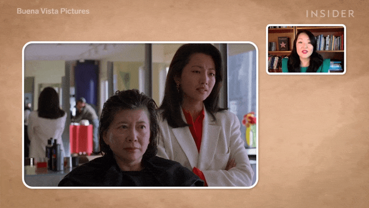
The other Voices of Color YouTube series was For The Culture. Very similar to the idea of Still Standing, it featured trades that have been in a person or group of people’s culture for ages.
The producers were looking for me to partially mimic the Still Standing style. So I mixed a bit of the rough textures and lens leaks from Still Standing with a new more craft-like style for For The Culture.
Since we were focusing more on a process that was passed down through generations, I thought a journal-like, paper background would fit it. That way the archival images could be presented as old photos taped to the paper.


Having watched a lot of DIY shows and seeing how some people, including myself, label boxes with masking tape and a marker, I wanted to use that idea for the text on screen. So the lower thirds ended up being on a piece of masking tape and the geotag’s pin was an “x” made from masking tape.


The animation sections shared the same style as Still Standing with image cutouts. I was able to add more detail to the motion of things because I had more time to work on these episodes.